I specialise in making websites for photographers and I have gone through thousands of photography websites in the past decade.
Due to the sudden increase in the popularity of do-it-yourself web builders, everyone is now a web designer. It is just the same phenomenon we encountered in photography when smartphones started becoming popular. Anyone with a camera-phone suddenly became a ‘photographer’. Just start a Facebook page named “FirstName LastName Photography” and BAM! you are now a professional photographer!
Just like how an inexperienced guy with an iPhone camera doesn’t take photos of the same quality as a professional photographer, the websites build by the majority of people using these Do-It-Yourself Website builders are also of poor quality. Professional web designers will always make websites of better quality and photographers of all people should understand it.
So, if you have the budget then hire a web designer to make your website. This guide is just for those who still want to make a website on their own probably due to lack of money.
Types of photography websites
Believe me, there are dozens of types of photography websites. For example
- Full-screen photography website – The website’s homepage background is one large full-screen photo and you usually cannot scroll. The navigation bar and content are kept on top of this big photo.
- Minimal photography website – As the name says, it uses very little use of design and is often as simple as possible. Mostly it uses while or black themes with very little colour. Its primary focus is on the photos.
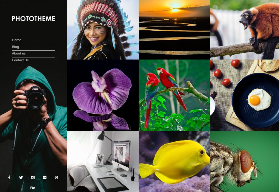
- Grid photography website – Large number of photos are shown as a grid in the homepage

- Photography website for studios – This is like a typical business website, but for photography. The homepage is filled with features, information, testimonials and things to impress potential clients. The sample photos are usually kept on a separate page called Gallery.
- Album Photography website – This is typically used by hobby photographers who just want to showcase their content. It has photos sorted into different albums in the homepage. Usually, there are thousands of photos and it is kept there for ease of sharing, like a personal depository of all photos.
Use your photos properly
Whatever type of website you want to build, you should carefully showcase your best photos in an attractive way. You are a photographer and the photos should be the main part of the design. Give huge importance to photos than text.
Good carefully chosen photos can become a design on its own. And, poorly chosen photos can destroy a good design.
Use good typography
You should reduce the amount of text on your website, but whenever you use text, remember to use a good font. Play around with the fonts, sizes and positions. You are a creative professional, and it is worth it to show your creative competence in such things.
But, do not overuse typography. At most, use four fonts in a site. Anything more will slow down your site and wouldn’t usually look good.
Go simple with the design

Whether you are making a minimal site or not, you should try to keep things as simple looking as possible. It is the trend nowadays and it is also part of good design philosophy. You may be attracted to a particular crazy looking design, but the majority will always like the simple design.
Create some contrast
As a professional photographer, you must be well aware of the ways to use contrast in your favour. Use this skill set in making your website too. Photographs often look really good on dark backgrounds. The images tend to stand out, and this is why most televisions, monitors, laptops etc have a black border-box around the display. If you think it is possible, try to use dark backgrounds. White/greyish background also works really well if you have certain types of photographs.
Use a good lightbox

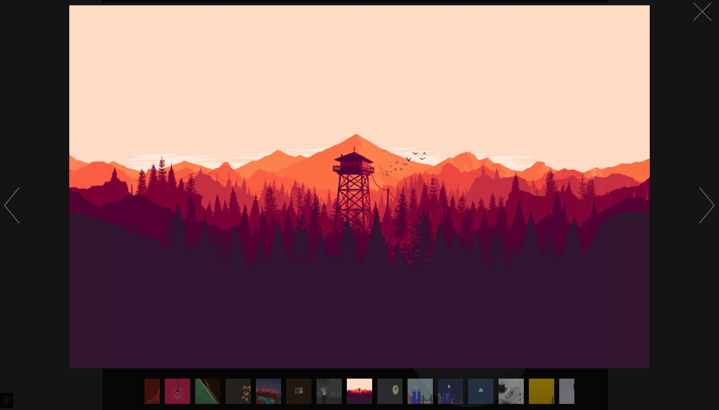
Many users would want to see enlarged versions of your photos. Lightbox is the thing which zooms into a photo and shows it in full size over the website’s content. I have seen plenty of sites with poor quality lightbox. And, this surely affects the quality of the site.
People visit your site to see your photos, and please make it easy to use your lightbox.
Optimise photo sizes
Photography sites are often very heavy in terms of bandwidth in comparison to other types of websites. More the size of your site, more the time it takes to load your site. You may have a super high-speed internet connection, but not many others have that privilege. So, you should only post photos of the right resolution.
I have seen many photography sites where photographers have uploaded their full resolution photos(40 Megapixels) and thus made their website totally useless. A dozen of these photos and your website is practically useless.
The right size for a photo in the grid is the size of that grid, and the right size for an enlarged photo in a lightbox is Full HD(two megapixels). Yes, there are few people with 4K display, but those people are in so low number that it doesn’t make sense to inconvenience the majority for these few people. If you still want to please the 4K audience, then you should add a plugin to your site which serves images of different resolution based on user’s screen resolution. It is possible and some sites use it.
If you want to further optimise your photos, you may want to use a tool like Compressor. It uses an algorithm to reduce photo size without affecting the quality.
Test Mobile friendliness
Nowadays, nearly all tools to make websites are mobile friendly/Responsive. However, not all websites made on these tools are actually mobile friendly. So, make sure to test your site on few smartphones.
It is critical to be mobile friendly in today’s world. Almost half of my website’s traffic comes from smartphones and tablets. You will miss out on these visitors if your site is not optimised for mobile. Your portfolio site should load properly on a slow 3G internet connection.
Easy Website Navigation
The standard navigation style is something like this:
- Home
- Portfolio
- Weddings
- Engagements
- Portraits
- About
- Blog
- Contact
And, it is often better to stick to this style unless you have some totally different requirements. If you are a hobbyist, then you would have a page called Gallery instead of Portfolio, and you can choose to sub-categorize however you like.
Conclusion
If you have the budget, hire a good experienced web designer. He/she will be able to make your site better than yourself. If you don’t, then please read the guides on this website before making your photography website.

Leave a Reply